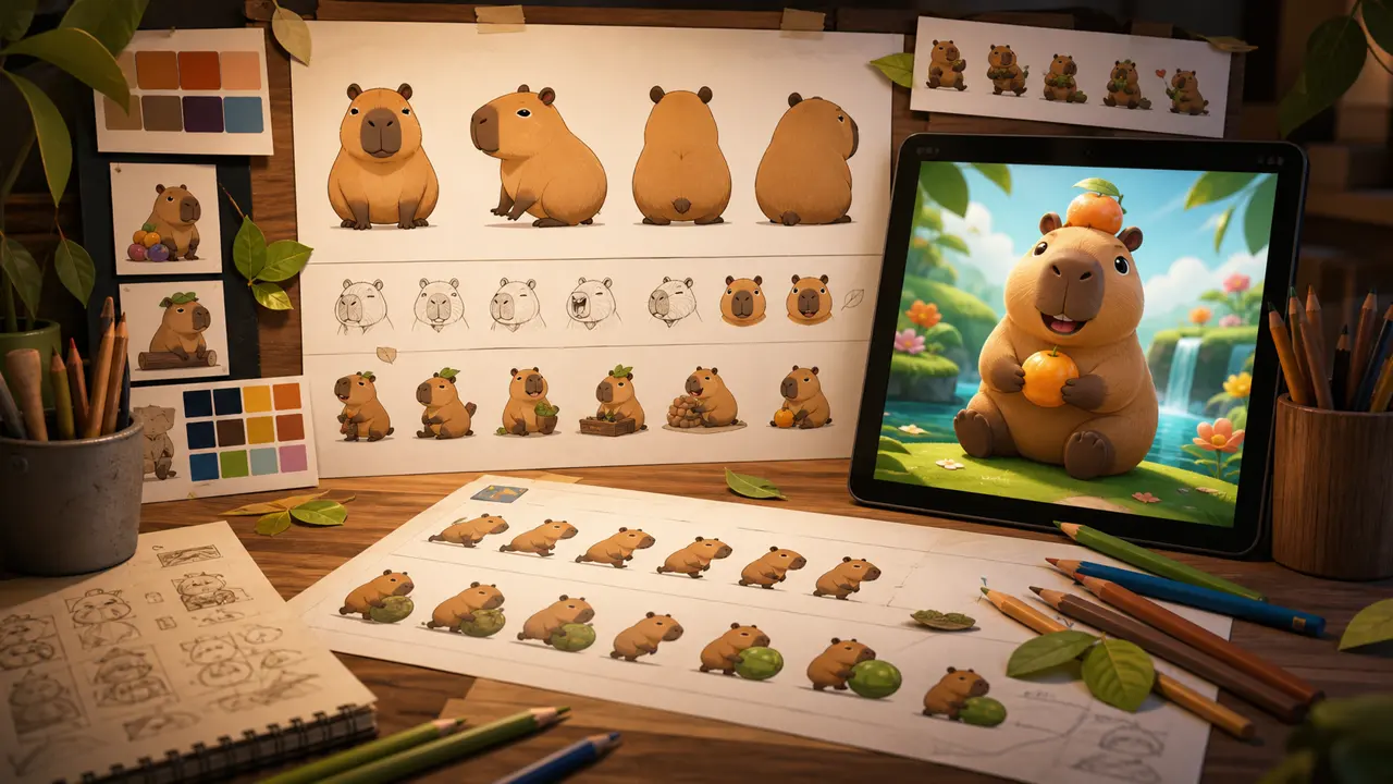
Cute art still has a serious job: every piece must be readable while the player is making a decision. The visual direction of Capybara Grow combines warmth with clear puzzle communication.
Start with the silhouette
An animal should remain recognizable before its tiny details appear. Distinct ears, body shapes, tails, and poses help players scan the board quickly. A mouse and a capybara need different visual weight even at phone size.
Use color to organize attention
Warm natural colors make the world friendly, while stronger accents mark interactive moments and goals. Backgrounds stay quieter so animals remain the focus. Contrast is checked on small screens, not only on a large art monitor.
Give every animal a personality
A slight head tilt or an eager idle pose can suggest character without delaying play. Expressions are kept broad and readable. The aim is to make each discovery feel like meeting a new friend.
Animate the result, not the wait
A merge needs anticipation, impact, and a clean reveal. Those beats should be quick enough to preserve flow. Particles and squash-and-stretch guide the eye toward the upgraded animal, then settle so the next move stays visible.
Design for real mobile conditions
Players may use a small phone outdoors, hold it with one hand, or play for only a minute. That means generous touch targets, crisp shapes, restrained effects, and compressed assets. Good production art is both attractive and practical.
Art supports the whole puzzle
The final test is not whether one animal looks appealing in isolation. It is whether a crowded board stays understandable and a successful chain feels rewarding. Read the production story for more about how the game’s systems come together.